The big ideas behind the HIMfertility brand
Rhod Gilbert’s documentary, Stand Up to Infertility, has now aired on BBC Wales. After months of hard work, we were proud to see the fruits of our labour finally showcased on the small screen.
The HIMfertility campaign was an exciting project for us to work on – and, now that the documentary has aired, we wanted to share some insight on how we arrived at the HIMfertility brand, which formed such an essential part of the campaign. We spoke to our brand manager, Simon, for his take on how he brought the HIMfertility brand to life.
What was your brief for creating the HIMfertility brand?
The brief was to create a brand that had high-impact and appealed to males from the age of 16-45. It had to be a brand that Rhod Gilbert felt comfortable promoting, incorporating an element of light-heartedness, with serious undertones, which related to Rhod’s personality.
How did you come up with the brand name and strapline?
We had a meeting with Rhod in our London office and discussed a few names based on the ‘Movember’ campaign that takes place annually. But, on reflection, we felt it was important for the campaign to have longevity, and not be limited to one month a year.
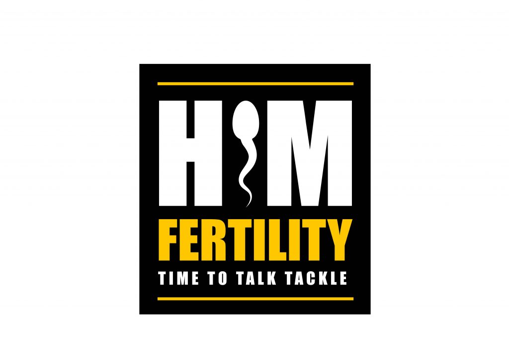
After numerous meetings with our creative team, we came up with the name HIMfertility, which ticked many boxes and also ‘does what it says on the tin’. One of the target audiences that Rhod identified was the rugby club lads who talk about sport rather than their emotions and things that affect their personal lives. From this target audience, we devised the strapline ‘Time to talk tackle’, which had a light-hearted tone and used language that would appeal to all men in our target age group. After various checks to see if anyone had used the same name and the availability of a website address, the campaign name and strapline was born – HIMfertility, Time to talk tackle.
What was your process for coming up with the branding?
With very little online exposure of the topic, we pretty much had a blank canvas to create the campaign concept. Our key considerations were to:
- resonate with the target audience
- be bold and stand out
- use appropriate colours and fonts
- consider the tone-of-voice that the creative needed to encapsulate
- be versatile across the various marketing channels
With those considerations firmly in the minds of our team of designers, we came up with initial concepts to bring the ideas to life.
We eventually decided to use the concept of a sperm as the letter ‘I’ which immediately tells you what the campaign is about. We selected a strong, bold, and unafraid font that stood out to reinforce that it’s okay to talk about infertility.
We chose the colours black and yellow as these were colours that were often used in the power tool industry and would relate to the ‘macho male’ audience that we needed to target. These were the men who would seldom speak about their emotions and were less likely to talk about their infertility issues. With Rhod loving the visual identity, it was time to produce various collateral featuring this concept.
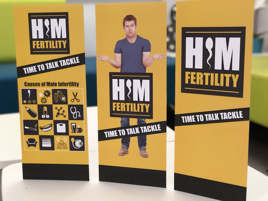
To give the campaign legs, we strongly believed that Rhod should be the ‘poster boy’ for the campaign and, after a little initial resistance from Rhod, he agreed that he would be the ‘face of male infertility’.
We designed a website, roller banners, leaflets and social media graphics that would be used to promote the campaign. These were rolled out at the launch at St David’s Shopping Centre, Cardiff.
Talk to us about those icons for the causes of male infertility!
Part of the campaign was to inform males that the lifestyle choices they make now, could dramatically affect their fertility in the future, so we designed 16 easy reference icons that illustrated those factors.
We used these 16 icons with a few red herrings to play a game with shoppers at the launch to get males to open up and talk about fertility. This was also a useful tool to eradicate any myths or misconceptions about the subject.
What was Rhod’s reaction to the branding?
When Rhod saw the brand for the first time, he loved it. But when we showed him the roller banners and website with his face on it, he did become a bit anxious as it all started to become very real to him.
What do you think the HIMfertility brand says to members of the public?
I think the brand is relatable; it’s confident without being patronising but most of all, it communicates with our target audience and shouts out that is okay to talk about the issue of male infertility. We had great feedback from our test groups.
Rhod being the face of the campaign gave the brand extra impact and an added empathy-factor as he is a credible, well-known personality who has experienced the issues that we were highlighting.
What was your favourite part of working on this branding project?
Seeing the brand come to life at the launch was a really proud moment for me. It’s bold, bright and hits the right tone. It stood out among the visual noise of a busy shopping centre and drew in men to openly talk about infertility. It did its job and did it well.
If you’re keen to talk to us about creating a new brand, or revamping your old one, please get in touch.