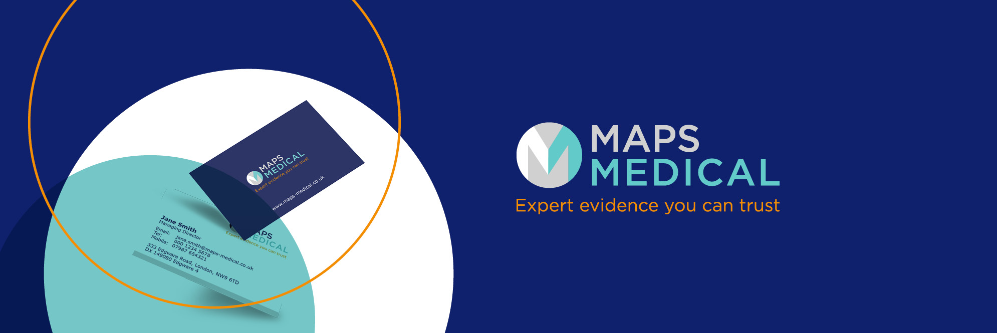
Transforming MAPS Medical’s brand and website
Freshwater works with MAPS on a retained basis, managing the organisation’s branding and digital marketing to build profile, generate leads, showcase its corporate social responsibilities and support its commitment to continuing professional development.
Brief
When Freshwater began working with MAPS Medical, our initial brief was to deliver a communications audit, competitor analysis and market review in order to establish how MAPS could increase its market share in a competitive environment.
Delivered a communications audit, competitor analysis and market review
Developed a new brand and launched a new set of core values
Rebuilt the website with a greater focus on brand and enhancing UX
Delivery
A review of the organisation’s brand was pivotal to the audit and research showed that while brand recall was high, an outdated visual identity and website were preventing growth and potentially damaging reputation.
Using the audit insight, Freshwater created a new brand concept, brand guidelines and suite of messages to better reflected the business. The new brand was delivered alongside a new website to ensure MAPS’ online presence reflected the quality of its offer, with a streamlined user journey and new content drafted to attract quality traffic and drive conversions.
A digital marketing strategy was delivered to build brand awareness and drive website visits. Tactics included on-site search engine optimisation and content marketing, email marketing, and display and Pay Per Click advertising. This was supported by PR activity and a new LinkedIn profile.
Freshwater later revisited the organisation’s branding and online presence in light of a new strategic approach to consolidate MAPS’ position in the market. A brand redevelopment was implemented, placing greater emphasis on quality of service, track record and reputation, as well as the ethos and unique nature of the organisation.
A new website was built, with a design and functionality to meet the organisation’s objectives of a client-friendly ‘shop front’ communicating its expertise, ethos and commitment to its established client base.
User experience was at the forefront of the project and a simplified sitemap, straightforward enquiry forms, and brand-focused copy were implemented to encourage enquiries from genuine leads.
A new analytics and reporting structure was also set up using Looker Studio to help the MAPS team understand the performance of their new site.

Results
Following the launch of the new brand and website, results include:
- Increasing users by 18% and pageviews by 10% in a year
- Increasing users by 31% and pageviews by 7% from organic in a year
- Increasing traffic to CPD insights articles by 27% in a year
